Celebrating creative design briefs
Welcome to the cutting room floor – where great ideas strut their stuff, pull off backflips, and blow raspberries before getting kicked to the curb because of projects getting put on hold, boring rules, or the safer options winning out. Long live wild ideas!
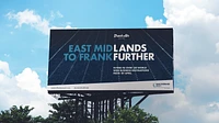
Pitch concepts take flight
This pitch concept was developed for East Midlands Airport as part of a fictional brief to promote flights to Frankfurt, a key European hub. The campaign highlighted Frankfurt’s connectivity, allowing passengers to reach long-haul destinations and positioning EMA as a gateway to global travel.
This project provided an excellent opportunity to showcase our creativity to a major UK airport, part of the Manchester Airports Group, and potentially spread our wings and work within the group (pardon the pun).
Great ideas are often very simple, and as any creative will tell you, start with great copywriting. This concept exemplified that principle. With clean typography and no visuals required, it perfectly met the brief and brought a broad smile to the airport pitch team.
Best of all, we won the pitch, securing a three-year contract with East Midlands Airport. More recently, we have been working with the Group to produce Sustainability Strategy documents for each airport.
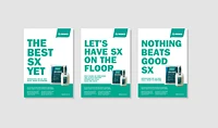
Sexy flooring compound
Our client, Tremco CPG, manufactures and sells SX302, a moisture-tolerant, cement-based latex underlayment designed for domestic, commercial, and industrial use before installing carpet, wood, or vinyl flooring.
With a new improved formula in development, they asked us to create a campaign promoting SX302 to a predominantly male audience at trade counters.
Playing on the 'SX' in the product name having an uncanny resemblance to a certain word, we developed a bold and cheeky set of ads designed to grab attention.
While Head of Marketing Laura appreciated the creativity and even found it amusing, she felt the tone didn’t quite align with the Tremco brand. Nonetheless, our work left a lasting impression, and designers know that coming up with brilliant ideas is better than SX!
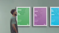
A touch of magic for the bean counters
British Land is a leading property company that creates, owns, and manages some of the UK’s most sustainable and high-quality real estate. Their portfolio includes premium commercial properties, with a focus on London campuses, retail parks across the UK, and urban logistics hubs in London.
During a review of their internal finance systems, British Land identified several inefficiencies, including complex procedures, fragmented data, and time-consuming processes, leading to late payments and dissatisfied suppliers.
To address these challenges, they commissioned Ledgard Jepson to rebrand their new system, Panama, and develop an internal campaign to communicate its benefits.
Understanding that the target audience are busy professionals, we designed a campaign that avoided complex messaging and hard-to-decipher metaphors. Instead, we crafted four clear, concise messages that tackled the shortcomings of the old system while emphasizing the advantages of the new one.
The client loved the concepts, which were developed to a print-ready stage. However, due to broader organizational changes, the project was ultimately put on hold.

Wheelie good idea wins award
This was one of those occasions when we couldn’t resist showing the client even though we knew that it was perhaps a bit close to the bone and would be rejected.
The brief from Veolia and Sheffield City Council was painfully simple – promote the use of the blue wheelie bins in specific areas of Sheffield to collect cardboard for recycling.
The chosen districts were predominantly populated with immigrants who spoke little or no English, so you can understand why this concept was not used despite them loving the idea and considering it for a short time until their bravery dissipated.
Thankfully, we won the pitch, as well as a ‘highly commended’ from the illustrious Chip Shop Awards.
The chosen concept was as simple as the brief itself. A series of three ads with an image of the blue bin with the words ‘fill it’, ‘use it’ and ‘bin it’ and displayed on 48 and 6-sheet posters around the city with an uplift in bin use reported in the first three months.

By Royal appointment
It’s not every day you receive a brief from the Royal Family. Well, technically, this one didn’t come directly from Her Majesty – it came via our client, DB Schenker, which manages the Royal Train on behalf of the Crown.
They asked us to pitch ideas for a redesigned Royal Train logo, which they felt had become dated and needed a modern touch. The logo was displayed on the side of the train, as well as on other livery and printed materials.
Our ideas would be presented to Her Majesty to determine whether she felt the change was worthwhile. This was an opportunity our design team embraced with a great deal of enthusiasm.
We were particularly pleased with the concept we presented: a stylized crown incorporating a subtle representation of railway tracks. A beautifully executed logo—fit for a Queen, you might say.
Unfortunately, the powers that be decided to stick with the original design and fortunately, we weren’t summoned to the Tower of London for execution!