Delivering Brand Clarity® without compromise
We create brands that hit the right notes with your audience and present a clear picture of what makes you stand out in your markets. We're an agency with decades of experience creating and launching new brands, as well as breathing new life into old ones.
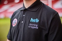
HEB
Strategic brand, website and digital marketing
Ezz Steel
Strategic branding and design
.webp)
St Luke's
Strategic branding and implementation
B2030
Brand and placemaking
Barnsley 2030 logo design overlayed on colourful drummers during parade
Barnsley Christmas Market
Branding and graphic design

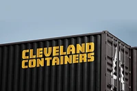
Cleveland Containers
Bold branding
Pickerings
Strategic brand, website and digital marketing


Discover more about our approach
Our Brand Clarity® process has been developed over many years of working with companies of all shapes and sizes. It is both iterative and consultative with each stage approved before moving onto the next, allowing us to keep a tight rein on costs and manage any conflict along the way.
We leave no stone unturned
Getting to the heart of what matters to you.
Through a combination of desktop research, site visits, meetings with you and your stakeholders or a series of brand workshops, we are able to digest the brief and get a handle on project aspirations and objectives. This phase ensures we have everything we need to create your brand that tells your story how you want it to be told.
Our magic starts with words
It’s our Wordsmiths' time to shine.
We set the tone of voice through an emotive brand proposition that sits at the heart of the brand and resonates with your customers. We then create the brand narrative that’s underpinned by brand pillars and a compelling brand promise.
Creating and crafting the big idea
Sketchbooks out – let the creativity begin.
The early stage of our creative process is about high-level, blue-sky thinking where several concepts are developed which are aligned to the brand proposition. These concepts are honed into a final brand presentation giving careful consideration to colour palettes, photography, illustration and typography with the ultimate goal of uncovering a final brand that will work across all formats and channels.
Protecting your new brand
Creating brand guidelines for consistent application.
Brand is about consistency, and as such, we create comprehensive brand guidelines that are designed to keep the new brand consistent across all online and offline channels. Final digital and print ready assets are supplied so you and your suppliers have everything required to roll out the brand.
Helping deliver clear communications
Shout it from the rooftops.
This needs to start from your own roof, as your people live and breathe your brand each and every day, as they’re part of what brings it to life.
Beyond internal launch, we can help support launching your new identity across whatever touch points are required - whether it’s van liveries or branded biscuits, we can support with launch plans and communication strategies to make sure your brand hits every relevant audience in the right way.